This is the chandy that was previously in my entry hall. One of the previous owners claimed they bought it from an antique store. And while it is a great light, I thought it was way too small for my entry hall, and one of the lights didn't even work.
I can't remember the square footage of my entry hall, but I do remember it is much larger than my kitchen.
This is the one we bought at ReStore for the bargain price of $25! It is HUGE! And it is also very heavy. I'm so not a fan of gold or brass and had design to paint it. But since I haven't figured out the other colors in there yet (more on that later), it got hung as is for now.
The old one came down, but since they didn't hang it from a stud (ugh) we (he) had to make a bigger hole since the new one was much heavier.
We had company, they (he) helped. They reinforced it.
And then it got hung up and they called us women folk into the entry hall to check it out. They thought it would be funny to hang it "my size" so I could easily change the bulbs. Mr. Company is demonstrating the shortness of it all. HA!
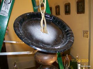
Back to business.........it works! But Oh Em Gee it's bright! You think 40 watt was a bit too much? LOL I can now operate in that room! We still had the business of the new hole in the ceiling though and without a cover around, we needed something quick! Mrs. Company (knowing my love of repurposing AND spray painting) suggested a paper plate! Genius!
I thought about NOT sharing that part, but really, in a pinch? That is genius! No one even knows what it is all hung up there pretty like.
See? And it looks oh so fabulous in there! We are thinking of getting a dimmer switch to tone it down a bit because I'm thinking even the 20 watt bulbs are going to be a bit much if you aren't operating!
Back to the business of color.......See that floor? It's fabric. I guess back in the day some of the more affluent people covered their floors in fabric to prevent drafts. They just painted them, saturate them is the instruction I got from a previous owner that recreated this look. It's currently caramel color.
The walls are kind of a sunny yellow color. It is NOT what I wanted but I was frustrated and moved on to another project at this point. You can see what I was wanting HERE.
My house consist mostly of the colors in this pitcher. The entry hall leads into this sun room whose floor is another problem child of mine. WHY PAINT WOOD FLOORS? *ugh*
This is actually the way the sun room looks now. But anyway...........if anyone has any advice or suggestions on what to do with these two floors, painting or otherwise, please feel free to chime in!


7 comments:
The corners of the house are so well lit.
The new chandelier looks wonderful! Isn't it always amazing how much of a difference a new light fixture makes to a room?
I also wanted to say thank you for stopping by my blog and your sweet comment about the clothespins! I sure hope you have a fantastic day! :)
Blessings,
Jenni
Hi Michelle,
I know you're not that happy with some of the details at the moment but I have to say that I love your house. The rooms all look so big and airy.
Have you seen what's underneath the fabric floor? Is it floorboards? If so, you could sand them and the ones in the sun room.
Paper plate?! That is genius. Love the big chandelier. It shows off your big hall beautifully.
We have our bathroom lights on a dimmer switch because otherwise they give off more light than the sun!
I always think dimmed lighting in halls looks lovely and mellow - and then you can jack them up for practical purposes if needs be.
Errr...I've left an essay....I'll stop now!
Sarahx
Sarah you are always so sweet and funny :)
I do love my house and suppose I just can't wait for it all to come together.
I have not seen what is under the fabric and quite frankly don't know how to look without tearing it up, lol.
Are you saying you could do surgery in your bathroom if need be too? ha
I love the paper plate idea - genius! We had a big chandelier like that that we put on a dimmer - much better. We ended up replacing it with a ceiling fan though because we needed better ventilation in that area. Yours looks great.
Your new light is awesome! And the paper plate idea, wow!
Yes, it's me again! I keep popping by in case you've posted again....
I want to see more!!
Sarahx
Post a Comment